
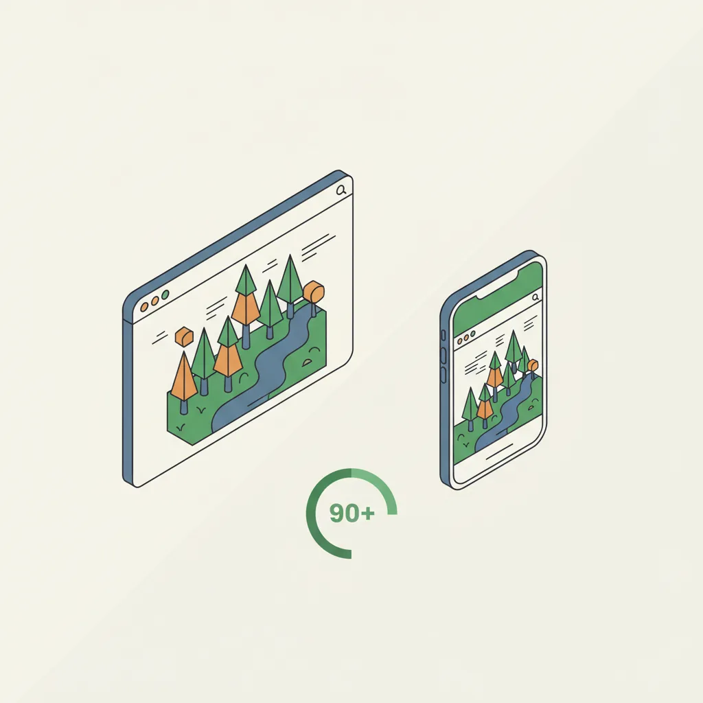
Can 3D Websites Work Smoothly on Mobile Devices?
The short answer is yes. The practical answer is more nuanced. Mobile 3D works well when built for mobile, poorly when desktop 3D is forced onto small screens.
The short answer is yes. The practical answer is more nuanced. Mobile 3D works well when built for mobile, poorly when desktop 3D is forced onto small screens. The difference comes down to understanding how mobile browsers render 3D and designing accordingly.
Do 3D Websites Work on Mobile Phones?
Answer Capsule: Yes. Modern mobile devices support WebGL, Three.js, and interactive 3D content, though performance varies significantly based on device capability and implementation strategy.
Every major smartphone produced in the last five years has a GPU capable of rendering 3D. iOS Safari, Chrome, Firefox, and Samsung Internet all support WebGL—the standard that powers interactive 3D on the web. Three.js, the most popular 3D JavaScript library, works on mobile browsers with proper setup.
The issue isn’t whether mobile supports 3D. The issue is how well. A flagship iPhone 15 or Samsung Galaxy S24 renders 3D smoothly with 60 frames per second. A three-year-old mid-range Android device might manage 20-30 fps with the same code. A five-year-old device might struggle to render at all.
This capability gap is larger on mobile than desktop. Desktop users all have reasonably powerful computers. Mobile users range from cutting-edge flagship devices to entry-level phones with limited GPU memory and processing power. This spectrum creates a challenge: build for the minimum viable device, or build for premium devices and degrade gracefully?
Modern best practices use progressive enhancement. Your 3D website shows fully interactive 3D on capable devices, simplified 3D on mid-range devices, and static image fallbacks on older devices. Everyone sees a functional experience, but the quality adapts to device capability.
How Do You Optimize 3D Content for Mobile Performance?
Answer Capsule: Optimization involves asset compression, responsive quality adjustment, touch-friendly controls, and fallback content—essentially treating mobile as a first-class citizen, not an afterthought.
Asset compression is foundational. A 3D model optimized for desktop might be 5-15MB after compression. Mobile networks can download this, but it takes time, consumes battery, and delays page interactivity. Mobile-optimized models are 500KB-2MB through aggressive polygon reduction, texture compression, and proper file formats like glTF with Draco compression. Your 3D model doesn’t look noticeably worse; it simply contains fewer polygons and lower-resolution textures than the desktop version.
Responsive quality adjustment means your code detects device capability and adjusts rendering quality accordingly. High-end devices render at high resolution with complex materials and lighting. Mid-range devices render at medium resolution with simplified materials. Low-end devices show optimized models with minimal effects. All use the same 3D interface code; only the visual quality adapts.
Touch interactions require different design than mouse-based interactions. On desktop, users rotate models by clicking and dragging. On mobile, they rotate by swiping. Desktop has hover states for UI elements; mobile doesn’t. Buttons must be larger for finger-tap targets. A good mobile 3D experience anticipates these differences and builds touch interactions as a core feature, not an adaptation.
Lazy-loading ensures 3D assets only download when users scroll near them. If your 3D model is below the fold, it doesn’t load until users scroll down, improving initial page load. This is crucial for mobile where bandwidth and battery matter more than desktop.
Fallback content is critical. If a user’s browser doesn’t support WebGL (rare but possible), or if 3D fails to load, they should still see a high-quality static image or video. This ensures mobile users with connectivity issues or older devices aren’t completely blocked.
Which Mobile Browsers Support WebGL and Three.js?
Answer Capsule: Modern versions of iOS Safari, Chrome, Firefox, Samsung Internet, and Edge all support WebGL fully. Older versions require testing and fallbacks.
iOS Safari (version 14.5+) has solid WebGL support. Chrome on Android supports WebGL across versions. Firefox Android supports it. Samsung Internet has good WebGL support. These cover roughly 95% of mobile web traffic.
The challenge is older versions. iOS Safari on iOS 12 or 13 has weaker WebGL support. Older Android Chrome versions have limited capabilities. Users on carriers with slower upgrade cycles might be running older browser versions. You can’t force users to update their phones, so you must handle graceful degradation.
Check WebGL support before attempting to render 3D. Use libraries like Modernizr or simple WebGL capability detection to identify if the browser supports what you need. If not, show a fallback—typically a high-quality 2D image or video instead of the interactive 3D.
Device memory matters too. Modern WebGL detection goes beyond “Does this browser support WebGL?” to “Does this browser have enough memory to run our specific 3D scene?” A device with 2GB RAM struggles with high-complexity scenes that a device with 8GB RAM handles easily. Smart implementations check available memory and adjust asset complexity accordingly.
What Happens When a Mobile Device Can’t Render 3D Content?
Answer Capsule: Your site should gracefully degrade to static images or video, providing a functional experience without 3D while maintaining visual appeal and usability.
Graceful degradation is the standard approach. Your HTML includes a 3D model container with a fallback element inside. If JavaScript loads and WebGL initializes successfully, the 3D replaces the fallback. If anything fails—unsupported browser, out of memory, corrupted model file—the fallback remains visible. Users don’t see a broken page; they see a static image instead of interactive 3D.
This fallback might be a high-resolution product photo, a video of the product, a composite image showing multiple angles, or even an SVG animation. The goal is visual communication of what the 3D would show. For a car, show high-quality photos from multiple angles. For a room tour, show a video walkthrough. The fallback isn’t ideal, but it works.
Progressive enhancement means your page is always functional, just with varying feature levels. A completely non-JavaScript experience is ideal but rarely needed—most modern users have JavaScript enabled. A no-JavaScript fallback is good practice but probably won’t impact most of your audience.
Testing is important. Load your site on actual mobile devices covering a range of capabilities (new flagship, 3-year-old mid-range, older budget phone). Verify that 3D loads and renders smoothly on capable devices, and that fallbacks work correctly on older devices. Don’t rely solely on browser emulation; real hardware reveals performance issues that simulators miss.
How Do Touch Interactions Work with 3D Websites?

Answer Capsule: Touch interactions use gesture recognition—swipe to rotate, pinch to zoom, tap for actions—translating finger movements into 3D camera and object manipulation.
Desktop 3D typically uses mouse-based interactions. Users click and drag to rotate a model, scroll to zoom, and click UI buttons for actions. Mobile can’t replicate this exactly because touch works differently—there’s no “hover” state, and gestures are different.
Standard mobile 3D interactions are: one-finger swipe to rotate the model, two-finger pinch to zoom, and tap to trigger actions (clicking a button, opening details, adding to cart). Libraries like Three.js provide built-in gesture handling, and third-party libraries like Hammer.js specialize in touch gesture recognition.
Touch responsiveness must be instant. A 200ms delay between finger movement and model rotation feels sluggish on mobile. Desktop users tolerate slight delays; mobile users perceive them as broken responsiveness. This is why mobile-optimized 3D must be lean—fewer polygons, simpler shaders—so the device can render at sufficient frame rates to feel responsive.
UI elements need finger-friendly sizing. A button that’s easy to click with a mouse cursor is difficult to tap with a finger. Standard guideline is minimum 44x44 pixels for touch targets. Larger is better. Spacing buttons generously prevents accidental clicks on adjacent elements.
Device orientation affects 3D presentation too. Some 3D experiences lock to portrait orientation; others support both portrait and landscape. Landscape orientation on phones provides more screen space and feels more comfortable for complex 3D interactions. Premium mobile 3D implementations support both orientations with responsive UI that adapts to available space.
Testing touch interactions is non-negotiable. Emulators can’t truly simulate touch responsiveness. You must test on actual devices to verify that swipes feel natural, zoom responds intuitively, and buttons are easy to hit with a finger.
Practical Advice for Mobile 3D Success
Mobile 3D websites succeed when built with mobile as a primary concern, not an afterthought. The pattern is: build for mobile first, enhance for desktop, test on real hardware constantly.
Start with your target user’s likely device. If you’re building for e-commerce targeting mainstream consumers, assume a 2-3 year old mid-range Android or iPhone as your baseline. If you’re targeting professionals, you can assume newer devices. Know your audience’s likely device profile and optimize for that tier first.
Use performance budgets. Decide upfront: “3D models must load within 2 seconds on 4G networks and render at 30+ fps on mid-range devices.” Then design and test to meet those budgets. Don’t add features that break your budget.
Invest in mobile-specific testing tools. Chrome DevTools on Android shows real device performance. Lighthouse includes mobile performance testing. BrowserStack offers real device testing at scale. Use these to catch performance issues before launch.
Consider third-party platforms built for mobile 3D. If you’re doing real estate 3D tours, platforms like Matterport are optimized for mobile from the ground up. They cost more than custom code but remove mobile optimization complexity.
The bottom line: yes, 3D works great on mobile when you design for it. No, desktop 3D forced onto mobile won’t work well. The difference is intentional, focused mobile optimization from the start.
Need mobile-optimized 3D?
Cause & Effect Strategic Partners builds 3D interactive websites that perform beautifully on every device—from flagship phones to budget tablets.
Get a Free Mobile 3D Consultation →
Frequently Asked Questions About 3D Websites on Mobile
Will 3D drain my phone’s battery?
WebGL uses the GPU, which consumes more power than standard browsing. However, reasonable 3D implementations don’t create a significant battery difference. Intensive, always-on 3D animations drain more battery than interactive elements that render on demand.
What percentage of mobile browsers support WebGL?
Approximately 95% of mobile web traffic comes from browsers that support WebGL. iOS Safari 14.5+, Chrome Android, Firefox Android, and Samsung Internet all support it. The remaining 5% receive static image fallbacks.
Can I use pinch-to-zoom with 3D models on mobile?
Yes. Three.js and similar libraries support multi-touch gestures including pinch-to-zoom. The implementation maps two-finger gestures to camera zoom controls. This feels natural to mobile users since it mirrors standard mobile zoom behavior.
What file format is best for mobile 3D models?
glTF (GL Transmission Format) with Draco compression is the industry standard for mobile 3D. It provides excellent compression, fast parsing, and broad browser support. A 10MB desktop model can be compressed to under 1MB for mobile using this format.
Should I build separate mobile and desktop 3D experiences?
No. Build one responsive 3D experience that adapts to device capability. Use responsive quality adjustment to serve high-quality assets on desktop and optimized assets on mobile. This is more maintainable and cost-effective than maintaining separate codebases.